As a science writer, I’m constantly battling against those occasions on which words fail me. Perhaps I don’t explain an idea clearly enough, or maybe I just can’t figure out what to say. Well, over 100 blog entries into Simple Climate, I’m actually going to (kind of) shut up for once. Throughout the year there I’ve been able to include some great illustrations explaining climate change, from how it works to the temperature changes we’ve gone through. This week I’m rounding some of them up here, along with some other diagrams I thought were powerful that I haven’t included before. Have a look – I hope they get your thought processes going as much as the normal entries do.
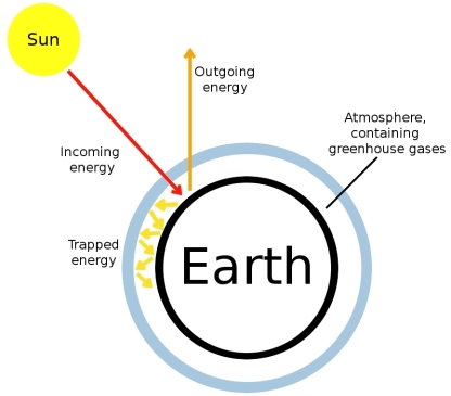
This is my attempt for a simple diagrammatic explanation of carbon change. Greenhouse gases in the atmosphere trap heat from the sun in our atmosphere. We need this: if it didn’t happen it would be too cold to live on earth. However, because we’re pumping so much greenhouse gas into the atmosphere – mainly CO2 from burning fossil fuels – it’s warming up more than it would normally.
The animated movie of the spread of ice loss into northwest Greenland observed by satellite from 2003 through to 2009. The colour scale along the bottom shows ice thickness in centimetres with the black colour reached in the south at the end of the animation representing an 80 cm loss.
The above video was first published on this blog in this entry. I’ve also published several other illustrations of how Arctic ice has retreated.
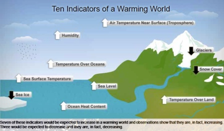
Ten indicators with increasing or decreasing values that demonstrate that the planet is warming. Credit: NOAA
The above image was first published in this blog entry.
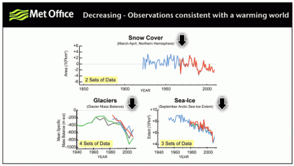
Three measurements related to world climate where decreasing values provide evidence of global warming. All are decreasing. Included in these measurements are glacier masses. Credit: Met Office
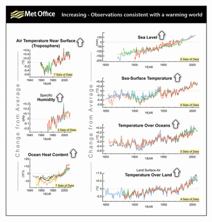
Seven measurements related to world climate where increasing values provide evidence of global warming. All are increasing. Credit: Met Office
The two images above are were originally published by the UK’s Met Office in July. I’ve also published another diagram illustrating sea level rise this year.
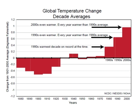
Another way at looking at the world's increasing temperature: Averaged over each decade, the Earth's temperature has increased strongly at the end of the 20th Century and early 21st. Credit: NCDC/NESDIS/NOAA
All four of the above images effectively illustrate the same blog entry. I’ve also included other diagrams showing sea temperature trends, trends in record temperatures in the US, average global annual temperatures for January-July,April, March, 2010 and 2009 overall. Plus I used the infamous “hockey-stick” graph showing how current temperatures compare to those seen over the past 1,000 years here.
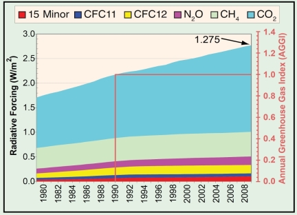
- Atmospheric radiative forcing – a measure of the degree of warming Earth experiences – of all long-lived greenhouse gases and the 2009 update of the NOAA Annual Greenhouse Gas Index (AGGI), which shows radiative forcing has increased 27.5% since 1990. Credit: World Meteorological Organisation
Original image and reference to source in this post, plus I also published another diagram showing the forcing effect of CO2 and other greenhouse gases.
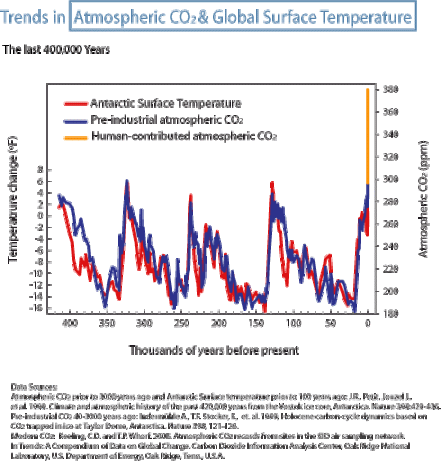
Temperature changes and atmospheric CO2 concentrations through history strongly demonstrate the effect of humans burning fossil fuels. Credit: Pew Center on Global Climate Change
I first included the above image in this entry on the blog. I’ve also published diagrams illustrating how carbon cycles between CO2 and other uses in nature, and how important this is for the amount of CO2 in the atmosphere. I’ve also published diagrams showing how another chemical cycle important to the climate, the water cycle, is being affected by climate change.
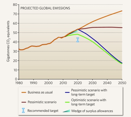
The range of greenhouse gas emissions that scientists predict will occur based on the pledges provided by governments after the Copenhagen climate negotiations in 2009, and how future negotations might change that path. A gigatonne equals a billion tonnes. Credit: Nature/Potsdam Institute of Climate Impact Research
The above image was first published on this blog in this entry. I’ve also published graphs illustrating emissions frompower sources and transport, how emissions are exported and have also published other blog entries covering projections of future CO2.
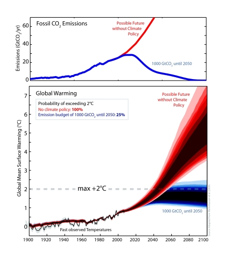
Using climate models, scientists predict that continued growth in CO2 emissions could lead to dangerous global temperature rises. The red lines represent a "business as usual" scenario that we might already be following, while the blue lines are what is needed to keep emissions below the 2°C level of warming that is usually considered as dangerous. Credit M. Meinshausen
The above image was first published on this blog in this entry.
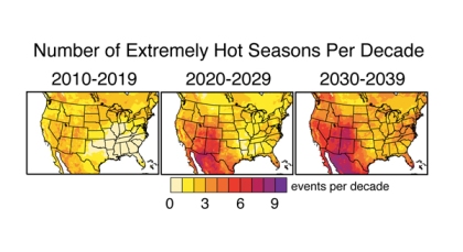
Climate models also suggest that by 2039, most of the U.S. could experience at least four seasons equally as intense as the hottest season ever recorded from 1951-1999, according to Stanford University climate scientists. In most of Utah, Colorado, Arizona and New Mexico, the number of extremely hot seasons could be as high as seven. Credit: Noah Diffenbaugh, Stanford University
This image was first published in this blog entry. The importance of this kind of warming is demonstrated by a diagram in this blog entry explaining why coral bleaches with higher temperatures. Other adverse effects of temperature include the staggering number of budgies that died in a heatwave shown in this entry, and how lizard populations are changing shown in this entry, and areas where researchers predict humans will eventually not be able to live due to the heat, shown here.

Nenhum comentário:
Postar um comentário